Sephyre Brand Identity
Sephyre is an up-and-coming logistics business based in Sissach, Switzerland, founded by Ramon Kobler and Nicole Furler. Their mission? Eliminate the stress associated with shipping goods – whatever their quantity, size, composition or location.
CLIENT
Sephyre GmbH
SERVICES
Branding, Graphic
YEAR
2016
Brand Strategy & Communications:
Renée S. Hernández Rutz
Art Direction & Design:
Cléa Lautrey
Logo Design
Sephyre’s identity reflects the company’s core values, which are what sets them apart from the bigger logistics chains:
Personal – friendly service customized to your needs
Secure – always reliable and efficient
A helping hand – relief from the burden of logistics, from packaging through to delivery
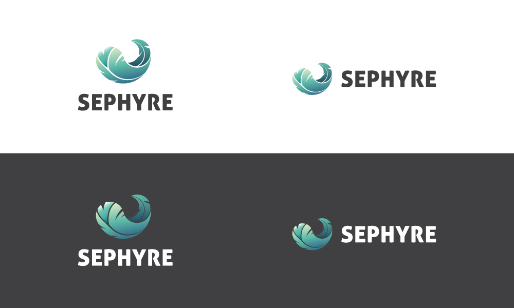
The feather symbol evokes weightlessness and motion, while the wordmark’s bold, capitalized type represents security and stability – balanced out by the typeface’s softened edges for a friendly, approachable feel.

The feather is the centerpoint of Sephyre’s brand.
Customers are invited to #followthefeather on social media;
the idea being that Sephyre is always on the move, ready to take on the next challenge.
Typography
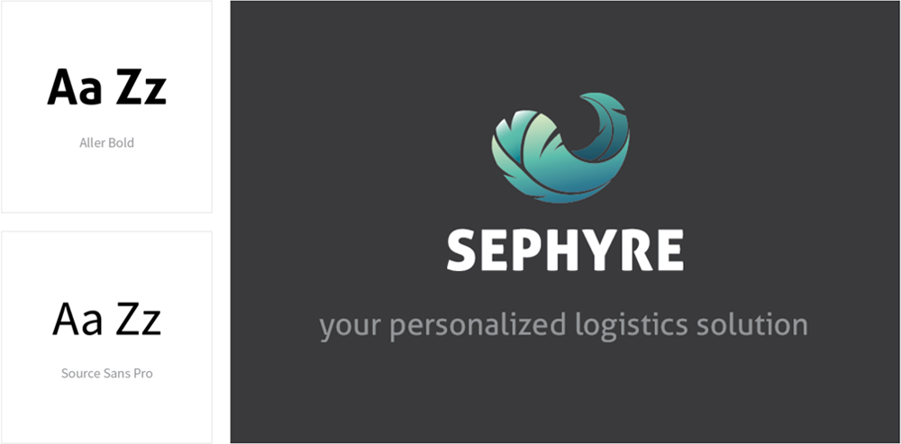
The humanist sans-serif characteristics of Source Sans Pro reflect Sephyre’s core values, making it a versatile supporting font; easy to read both on paper and on screen. Paired with the friendly but sturdy tone of Aller, used in the logo and slogan.
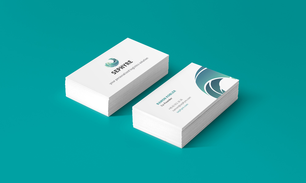
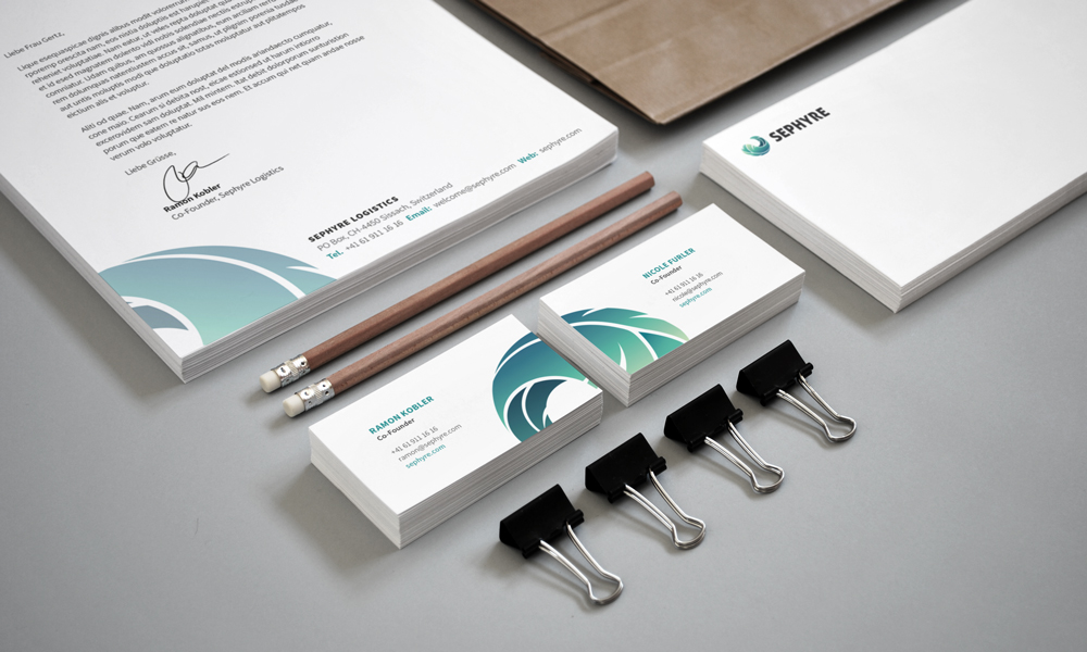
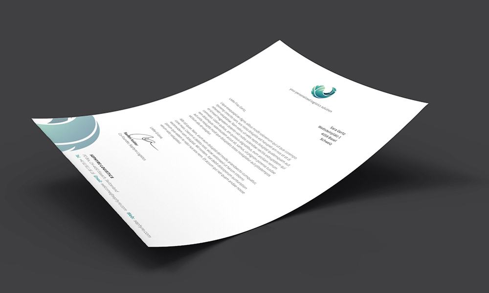
Corporate Identity
Very simple, minimal design accented with bold colour. Using the curvature of the feather to add a dynamic, playful touch, while still looking clean and professional.
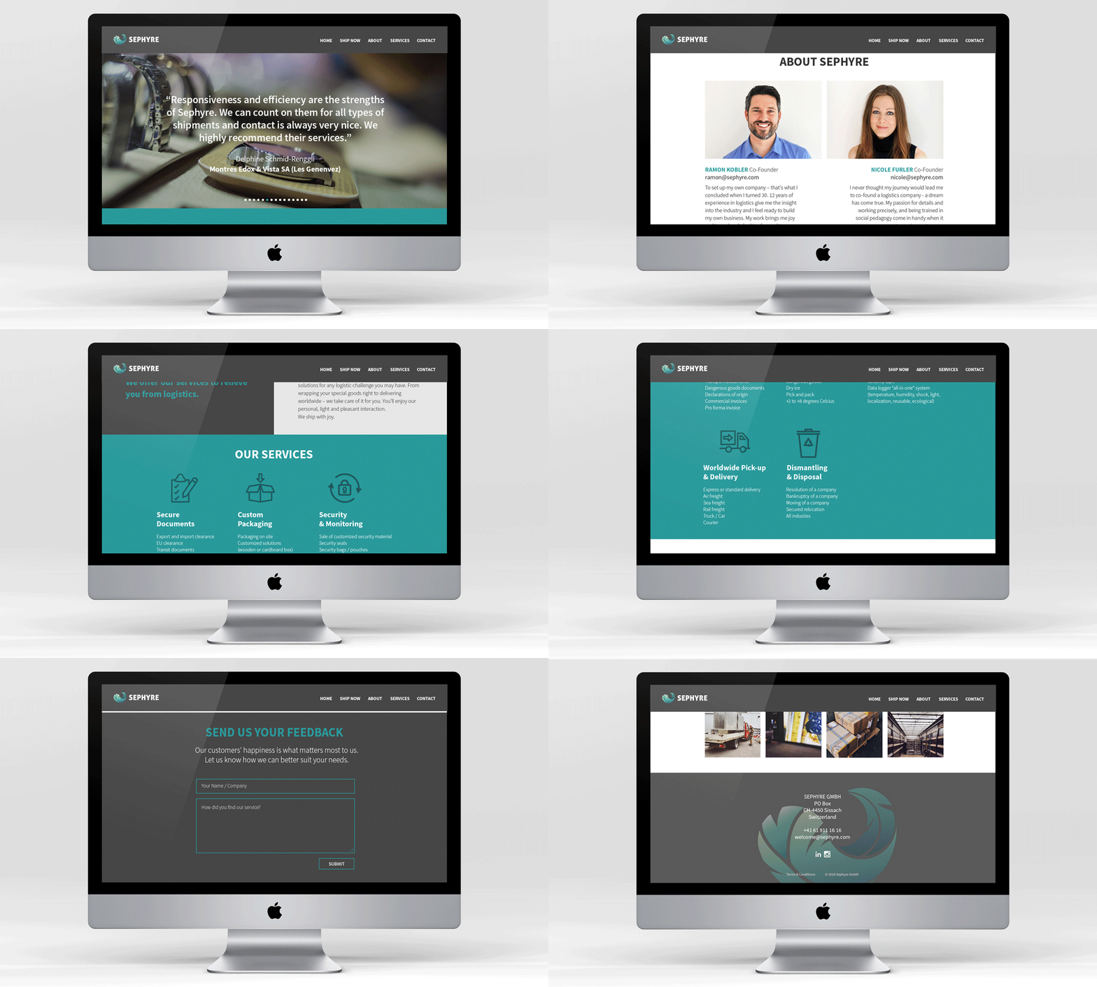
Website Design
For the company’s first online presence, we opted for a single-page parallax scrolling design – using a back-to-basics approach as the starting point. The website will likely evolve as the company grows.
