Viome Brand Identity
Viome aims to create a revolutionary health care company that views disease as preventable and curable, not just manageable; a way to empower people to take control of their health. The objective of this pitch was to create a cohesive visual language that reflects the brand's vision and positive impact.

Logo
Primary and secondary logos were already established before the branding process began; therefore it remained unchanged. Some guidelines were created for visual and functional consistency.

Brand Colours
The Viome palette consists of vibrant, deep primary colors and earthy, muted pastels as secondary colors, which are balanced out by an abundance of white and off-white shades. The dark grey shade echoes that of the packaging, and is used in backgrounds as a grounding hue.

Typography

Miller and its variants has been widely used in newspapers, magazines and other publications around the world, making it an ideal typeface for main headings on the Viome website.

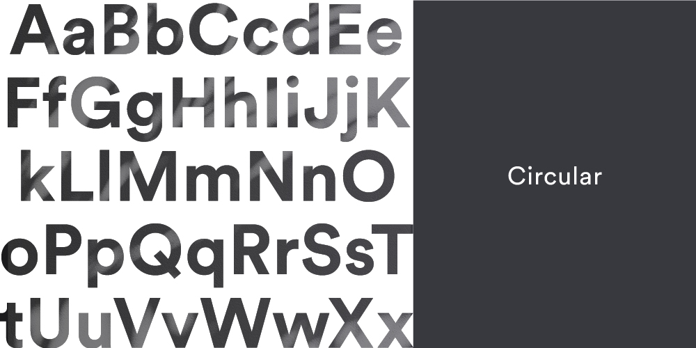
Circular’s characteristic rounded letters give it a feeling of warmth and approachability, while the strong structure provides stability and seriousness. Used for sub-headlines and UI elements such as calls to action.
Iconography
The brand's iconographic style is light, optimistic and minimal. These icons are used as a supporting visual language; a witty yet affirmative complement to the copy, or as an explanation of a concept. Fine strokes, sharp corners and just enough detail, comprised primarily of circles and squares.

Illustrations
The array of playful yet grounded colors from Viome’s palette come alive through the brand’s supporting illustrations. In this context, the primary colors are to be used sparingly and let the secondary colors shine. People and environments come together through rounded, abstract and simple shapes, evoking a feeling of humanity and friendliness.

App

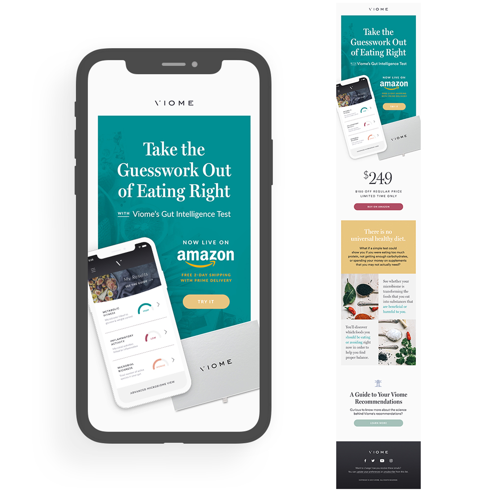
Email Marketing


